I took a break from C++ and Qt for a few years as I was working on other stuff, and when I came back a unique opportunity presented itself; I could look at Qt from an outsider's perspective not being as biased as before. Well I am biased, Qt is my all time favorite platform so who am I kidding. But I have seen the world beyond and just maybe I can spot some trends where Qt moved while I was gone? This is in essence my mandatory rant on UX in programming tools, with Qt & QtCreator as a backdrop.
NOTE: I am looking at this from a community perspective. I am sure if you pay for Qt your experience will differ in some respects.
Installation
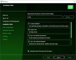
Installing Qt is still terrible, but a little better than it used to be. It still features an install wizard straight from the 1990s era, but at least it has green color to bring it into the future.
Seriously, the wasted potential is staggering. I wish someone would appoint me UX lead on the installer team, I would have a go at setting things straight. Seriously, get in touch! I will let the real-time html layout popping go I promise!
To be fair here are the options:
- Install ancient mangled version from your favorite Linux distro's repository (not recommended)
- Build from source.
- Just rememer to schedule 20 minutes of your time to actually find the download link on the qt.io website. This is what happens when the marketing people takes over. I mean they really tore a page from the the old Microsoft 1990s era FUD tactic playbook here. The only contender is the delete account wizard in the Boo dating app.
- Once you have the source.... uhm. ok so yes. I will... follow these steps and. Uhm.. It is almost as if someone made it extra hard on purpose.
- Use some 3rd party Docker image that encapsualtes the build. Because there are no official ones. Seriously, Qt company has no official Docker images to use their shit in 2023.
- Download online installer:
- On linux; a payloaded bash script with a windows style install wizard inside.
- On OSX; an img with a windows style wizard inside.
- On Windows; a native executable with a windows style wizard inside.
- The wizard has the worst UX of any installer I have ever used, and I have used alot of installers in my lifetime. It is actually inexcusable.
- Download offline installer:
- Nope, can't find it anymore. Is it there? Well you did a good job hiding it. PEBCAK.
- Download prebuilt binaries in ZIP format.
- I don't know if they even exist because all the files are so well hidden. If the actually exist then I am sorry for being a retard. PEBCAK.
Migration to Qt6
Migrating from Qt5 to Qt6 in my projects was actually not that bad. It took a day of search/replace/copy/paste for a fairly large codebase. Luckily I had lot's of tests to verify my changes but still the experience was good overal. QRegularExpression and QMedia* were the most hard to adapt.
The documentation spesific to migration was OK, but it could definitely have been much better. I would have loved to see a dropdown at the top of documentation pages where you could select the version you care about instead of fumbling around with google to find the relevant version. Also a collapsed comment on migration next to each deprecated member would be really helpful, instead of having all migration stuff collected on one big page.
Good documentation is one of the best sides of Qt so not complaining too much here!
CMake
CMake? SERIOUSLY?
I know this is a controversial topic. A lot of people like CMake, and a large minority dislike it. And I have a fairly strong opinion myself. Here is my breakdown;
I think that the people that like CMake like it for a completely different reason than why the other people dislike it. The people that like CMake are very pragmatic. They made it work with CMake and then it works and now we can go do something else. Or they were told by their non-technical boss to use CMake beacuse "customer X uses CMake and we must align with them".
The people that don't like CMake are more opportunistic and perfectionistic. I suspect there is a good overlap in this group with those that liked Qbs for this reason. They just can't look at CMake next to Qbs or qmake and think that CMake is the better choice. This group think (and I agree with them) while the rest of industry selected CMake, that alone is not a good enough argument to use it. Instead we should strive to surpass it on every metric beyond "popularity by mediocre middle managers" (to put it on point).
OctoMY™ is currently on a semi-hacked qmake setup that works great, but we are looking at Qbs to see if that could be even better. For OctoMY™ CMake isn't even remotely on the radar.File types support
File Operations
This peeve goes way back. Unfortunately it has worsened over time. It has several facets. I will start with the most annoying and obvious for me.
- Open source in editor, make changes and save
- Open terminal, invoke build command
- Open debugger invoke program, debug, find error
- Go back to editor make changes
- Repeat
Mandatory rant on UX in programming tools
Media support
I am not alone thinking about this, my question about encoding video from a sequence of QImages from 6 years ago has 63 votes and still no resolution.
Other annoyances
Finally a list of minor anoyances in QtCreator that I felt needed to come of my chest after years of brooding.
- The refresh action is missing in the file tree so now I find myself closing and reopeng the program every time a file has changed outside QtCreator. Luckily closing and opening QtCreatos is now super fast for some reason. It feels really snappy, so good job on that at least...
- The swap between source and header key combination is not <ctrl>+<tab> by default. C'mon guys.
- There is no key combination for switching between design view and editor view, and for some inexplicable reason, I am always moved to look at my design in read-only XML. dafuq?
- The editor view for design is READ ONLY? I have to open an external text editor to edit the XML for my design? SERIOUSLY? Why don't you just remove editor view entirely, and make it a special operation to edit for those rare cases when that is even remotely relevant? Am I the only one who is annoyed by this?
- Design view still takes up the whole screen. On modern 4k displays this is a travesty, a UX abomination. The Designer editor should really present inside a normal editor view.
- There is no "collapse all" and "uncollapse all" buttons in tree view. I have to dig thorugh a submenu. I might as well collaps and uncollaps the tree manually and it will be faster than finding those actions *sigh*.
- There are still issues with scaling for high DPI screens. The issues view cannot be zoomed like the other views(??) and is sometimes displaying text in way too small font.
- The "split side by side" is wonderful, however moving the separator is not intuitive. Expected is that "everything stays the same except the size of the two views next to the separator will change in size. Actual is "depending on which separator I move, SOME windows will stretch and other not". It should be super easy to fix, just remove the separator widget in place of a horizontal layout and add widgets to take mouse dragging to change the layout. Why is this not fixed ages ago?
- It is sometimes desirable to view files that are NOT in your project in the tree view. Yes I know, radical thought. How about adding the option to render all files found in directory with the files that are not part of the project grayed slightly out? You could even add an option to "include in proejct". Radical I know.





No comments:
Post a Comment